INU
INU is a connected electric scooter designed for urban transport. The project involved user research, product strategy, as well as UX and UI design for all digital touchpoints— from the INU mobile app to the scooter’s handlebar dashboard.
User Research
Our approach to INU's design was rooted in a deep understanding of the current and future urban mobility challenges and user needs. We began with extensive user research, conducting in-depth interviews and observations to identify pain points and expectations of electric scooter riders.


Insights
We found that riders prioritize safety, ease of use, and seamless connectivity between the scooter and its companion app, with a strong preference for features that personalize their experience, such as custom settings, ride preferences, and tailored recommendations.

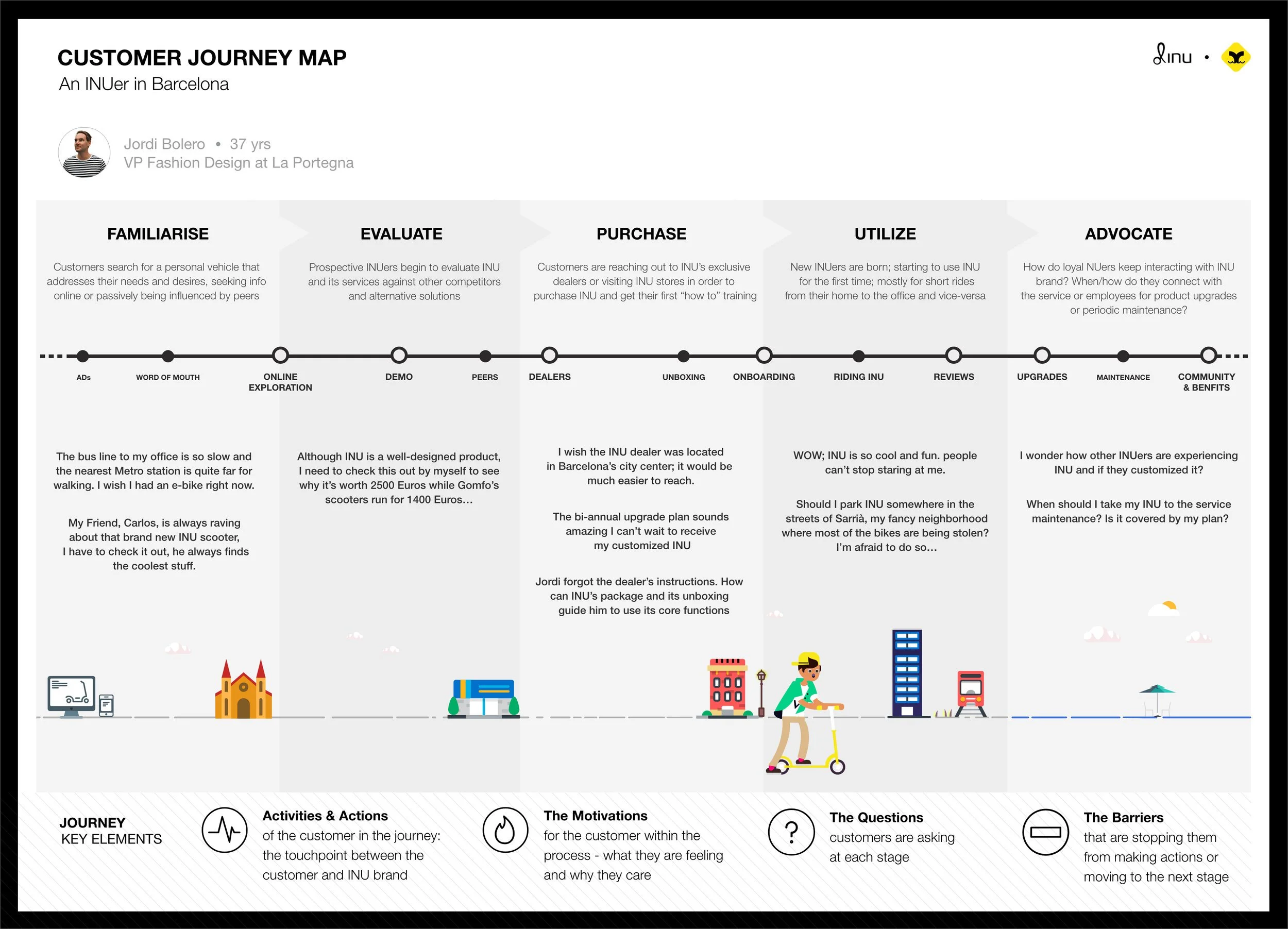
Customer Journey map
In addition to the research insights, we used storytelling to illustrate the ideal relationship between INU and its prospective customers, helping us better understand what motivates or discourages people at each stage of their journey - from purchasing the scooter to using it and ultimately recommending it to others.
Key Challenge
How to design a mobile app for the rider that integrates smoothly with INU’s physical dashboard?
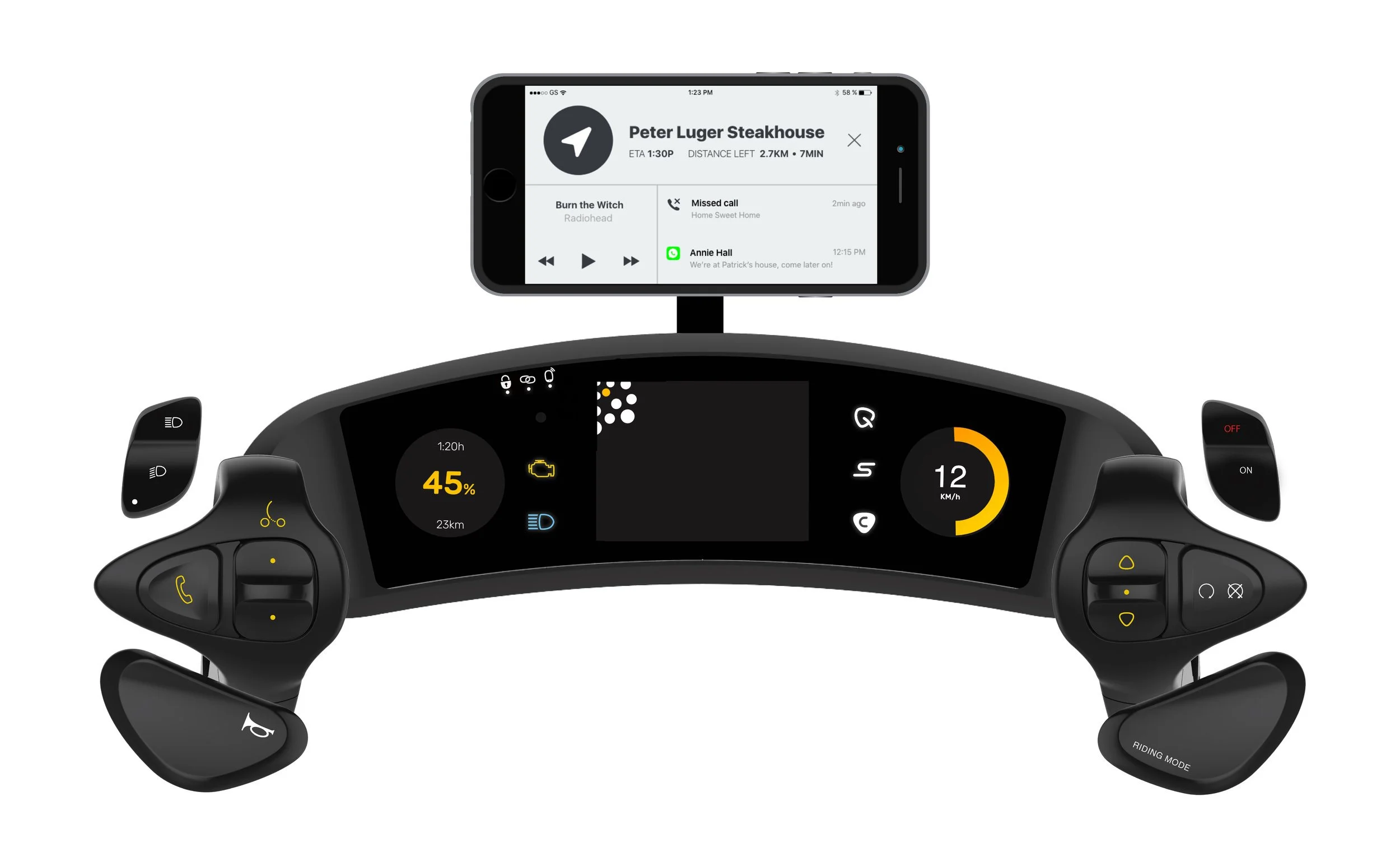
Wireframes: Ride Mode
This screen raises the rider's awareness of the most valuable indications while riding (navigation, communication, and media) and enable quick and easy actions when necessary.
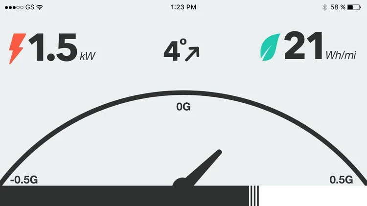
Wireframes: Performance
This gauge screen presents performance indicators in addition to the ones shown on the physical handlebar: motor power, efficiency, acceleration, throttle gain, and steep angle.
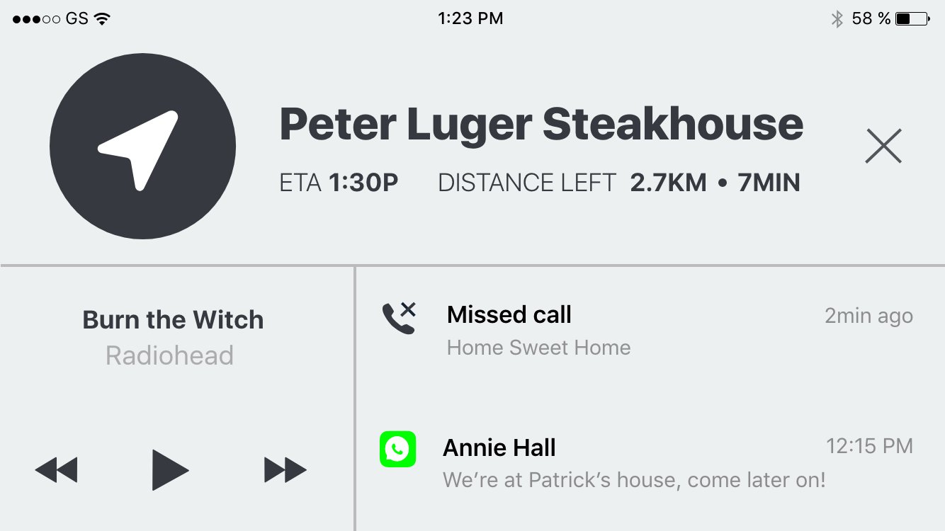
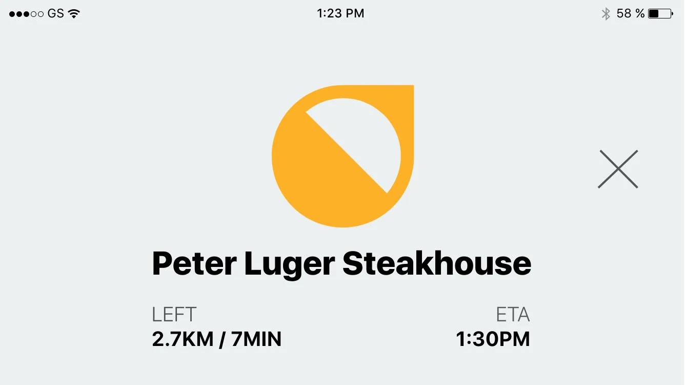
Wireframes: Navigation
The fill indication of the compass shows the rider's proximity to the destination. The "close" button is big and left positioned to enable easy finger-tapping while riding.
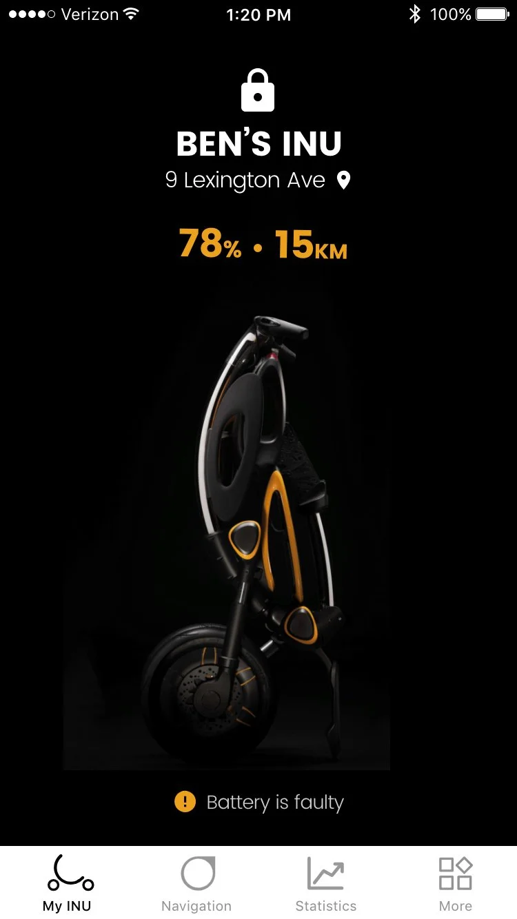
Home screen - early design concept.
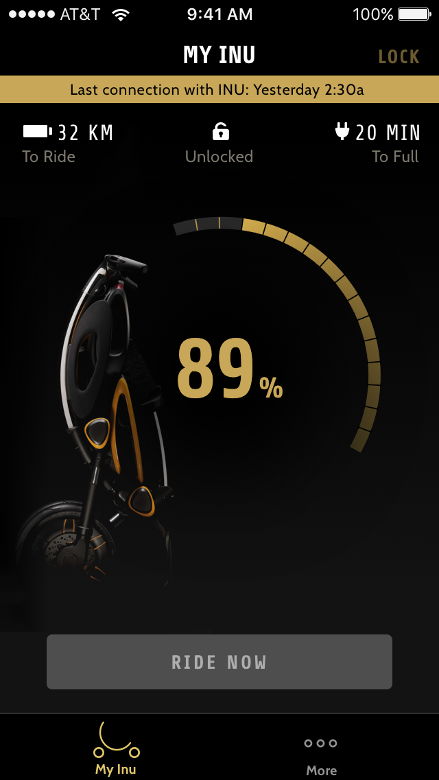
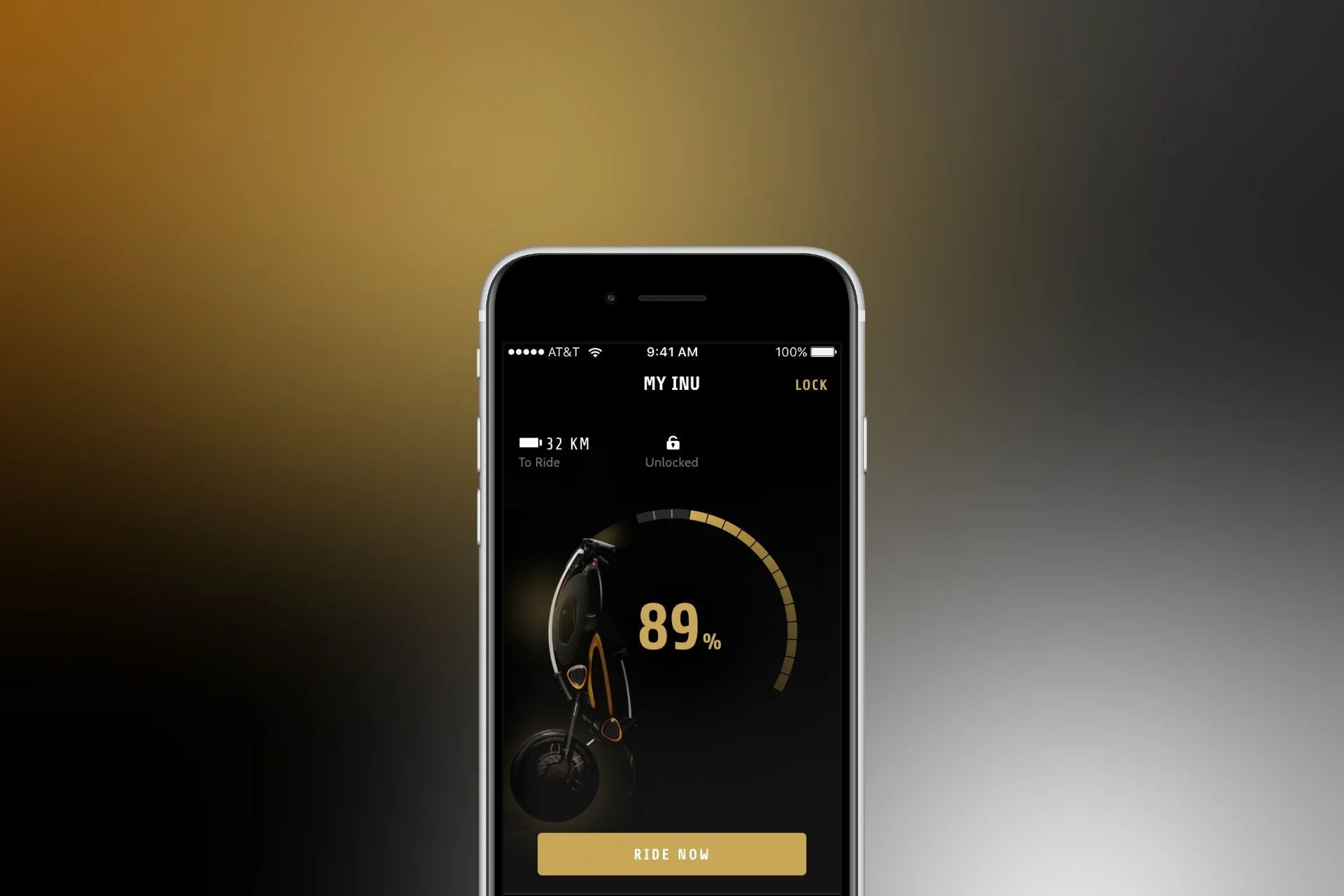
My INU home screen provides essential indications of INU: its Battery level, riding range, charging indication, current location, and lock status.
Visual Design
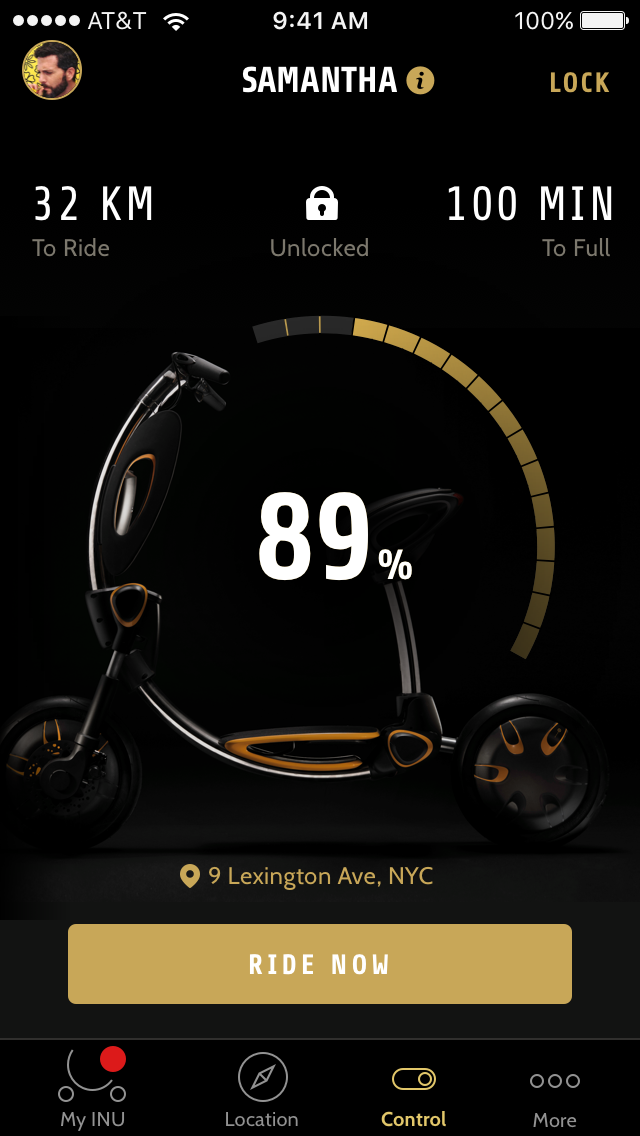
The main CTA button of the Home is the "Ride Now" button, allowing the user to quickly start riding INU with a single tap.
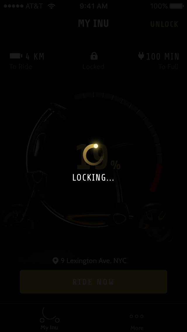
The interface prioritizes clarity and seamless interaction for key use cases like locking, unlocking, and battery alerts. Clear typography, intuitive icons, and indicators guide the rider effortlessly. Actions like locking/unlocking feature animations and haptic feedback, while battery alerts use contrasting colors for urgency. Prominent call-to-action buttons like “Ride Now” ensure quick, distraction-free decisions, enhancing both safety and convenience.
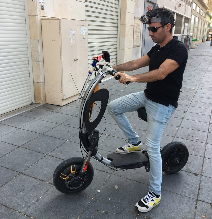
Validation.
Here I am taking the INU for multiple usability rides :)
While riding, I evaluated key aspects affecting the rider’s experience, such as data legibility (day and night), visual representation, cognitive load, and safety. Later, I collaborated with industrial designers, sharing insights from the research phase and working together to enhance the harmony between the physical and digital components, ultimately creating a unified dashboard